Monday, July 27, 2009

Sense of Style

Since my last post, I've been mulling over the concept of style within animations. I mentioned that Looney Tunes characters are wild and bombastic, and so it wouldn't make sense to have a subtle lipsynch. It just wouldn't match.
I began thinking about the styles of animation, and how they function as a whole - as a drawing, as a movement, as a theme, and as depth.
In order to get into the depth I'd like to, I'm going to break these up into separate posts, so you can get as much information as I want to cram down your throats without being a long-winded airbag. Or at least, more longwinded than usual.

Drawing is what most people think about, when they think of animation. It's Flash, it's traditional, it's cartoony, it's realistic. A style goes through the entirety of a single visual, within animation. It's not something that is restricted to characters - it goes through props, layouts, and special effects.

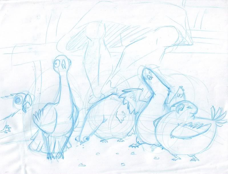
The first thing I thought of was Disney's Lilo and Stitch. It was one of their first movies to make a push for a distinctive style, rather than their usual quasi-realism. The characters are based from Chris Sander's designs, making every drawn aspect of this movie very round, and soft, with all sharp edges replaced with a more rounded feel.
Have a look at the characters here - whether human, or alien, all sharp or jagged areas have been replaced by a smooth curve - even the most pointed areas have been rounded off.

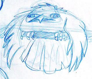
In particular, look at Plekley's antenna and shoulder pads, the alien on the far left with the horn, and Lilo's hair and grass skirt. All of those things, you would think would end in sharper points - wet hair is very jagged, as are grass skirts, but both these things have been thoroughly rounded out. The same thing happens in the tassles off Plekley's shoulderpads, but unfortunately, I'm not working with high-quality images.
You'll find that the same rounding off, of things that are normally very sharp or angular, are smoothed out when looking at props, such as Lilo's doll, Scrump, or any of the alien guns.

Even in special effects, you can see the rounding, which is the part I think is really neat. One of the things about special effects is that it pays to be not noticed. If they don't stand out, they've been done right. In this case, they have most definitely been done right.

Have a look at the water, and how it feels more like whipped cream than crashing surf. The feel of the gunfire really lends to the idea that they are plasma weapons, rather than the gunpowder we're so used to. And even when a WHOLE SPACESHIP is exploding, it's still soft, and rounded.
The interesting thing, to me, is the layout design of Lilo and Stitch. The entirety of the movie is soft, rounded, and gooey. If layouts fit that style, too, the entire movie would feel like being in a marshmallow world. So how did they keep the style, and have their realism too? By breaking the style.

By doing things in watercolour, they not only had a simple way to make the action stand out from the background, but they were able to do an interesting combination of ridgidity and softness. They could have their hard lines, to make buildings seem more feasible, but have a soft shading style that would still make it seem less harsh than the average layout of something like Lion King, where everything is equally saturated and hard.


It's easy to see how things in Lilo and Stitch fall together in a style. Even easier is a lot of television work, such as Nickelodeon's Fairly Odd Parents.

The characters - straight lines, ridgid, and when there's a curve, it's a very simple one - no S-curves in sight! Simplicity is the name of the game here, and you can see it repeated everywhere. The backgrounds are minimalist, as to have the most focus on the characters. They even push your focus by desaturating the background, making Timmy and his dinosaur the brightest, and most interesting things.


And here we have another grand example, involving layouts, props, and special effects.

The props are flat and basic, just like the characters. Check out the rolling pin of the lady on the far right, or the tire in the bottom right. Simple, iconic shapes.
Same goes for the special effects. Fire, as an icon, is a jagged shape, so that's what they did. The water spewing from the ground is a column, with a wibbly-wobbly blob on the top. Is that what water actually looks like? Not a chance. Do you recognise it? You bet. Even the smoke coming out of the sewer, or off the plane are just basic curves going up.
And again, the layouts are simple - the houses are literally just lines on the background of the sky. And once more, everything is very desaturated, except for the sections they want you to look - the characters, the fire, the water.
The entire style of this show is unified, with no excpetions to the rule. Neat-o!

Next week, I'll be scrambling together a post about Style as a movement. Stay tunes, kiddies!

Wednesday, July 22, 2009

Reading Lips, part two!

Several comments last week prompted me to do a more in-depth study of lipsynch in different areas. It was brought up that because cartoons now are mostly Flash based, there has been a different way of animating. This means that as well as a different means, there is a different process, which leads more to the spelling out of every letter, as shown by good old Timmy Turner. But what about the cartoons of old, where everything was hand-drawn?
This week, I've had a look at a few different areas to get a better scope. I've pulled up bits from X-Men, How the Grinch Stole Christmas, Looney Tunes, and Kronk's New Groove.

First, X-Men!
This was one of those shows that you love from childhood, hold in the highest regard, then re-watch later, and cringe at how bad it was. Naturally, I wanted to know just HOW bad it could get!
This first example, is about the quality I expected.

There are generalized mouthshapes - in this case, a simple, chomping open and closed, for the word "galaxy".


However, upon looking at another section, I was completely bowled over! Words defy this incredible example of lipsynching, so I will let you, the readers, simply look, and enjoy. The line was, "You designed the show!"


Once again.... wow.


Moving right along!


To put television into a different production value, next comes Looney Tunes! As a higher-quality television show, I expected it to hold up better, and better it did. This is Bugs Bunny, milking his way through the word, "beautiful".


Although I couldn't find any shots that openly used phrasing, the Looney Tunes style rather leans away from it, due to their characters. Everyone is so loud and outrageous that "subtle" lipsynching would just be weird. I mean, can you really imagine Daffy Duck slurring his way through syllables? Every syllable is pronnounced, if only to emphasize the wackiness of the characters, and put that extra dividing line between us, and them.


Next up is How the Grinch Stole Christmas!
I guessed that a TV special would rest lightly between television quality and movie quality. However, I ran into much the same issues as in the Looney Tunes example, although this is not terribly surprising, seeing as how Chuck Jones was also responsible for this one. However, not to be stingy, here's the breakdown that I found for the word "practically".


Next up comes Kronk's New Groove.
I expected this one to match a TV special - possibly even a little lesser in quality. However, I was pleasantly suprized! Although the characters did exhibit the same outrageous character, and therefore much of the 'pronounce every syllable' logic, the lines weren't spoken with the same pacing. This forced the animators to pick and choose which noises they wanted to show off, knowing that there simply wasn't always time to show everything. Here is Kronk, and a chunk of the sentence "head delivery boy".


As you can see, a rather large chunk of 'delivery' was taken out, in favour of the entire thing reading better. Which is not just remarkable because they chose not to have flapping gums, but also because that is just what phrasing would beg. When you say 'delivery', the entire first syllable is mashed into a single mouthshape.


In conclusion, what does this look like? A question of budget.
Television productions with a tighter budget, such as X-Men and Fairly Odd Parents, will push out whatever they can. If it's moving, it works! Luckily, in the case of Fairly Odd Parents, they have technology backing them. Even in ToonBoom, there is an auto-lipsynch function, allowing less time to be spent swapping symbols.
Television productions with a larger budget are more likely to take the time to at least find the right mouth shapes, if not proper phrasing. Would they use it, if the style demanded? The world may never know. (If you can think of any higher end, traditionally drawn, subtle television show, feel free to mention it, and I'll do what I can to get a decent analysis!)
As for both television specials and straight to DVD productions, it is also a matter of budget. The Grinch showed off his ability to pronounce anything with a mouth almost fully open, giving the necessity for every letter to show. Kronk, with the Disney budget backing him up, showed off his phrasing very well. Delightful! But once again, if anyone can mention a more recent(preferably traditional) television special, or a lower-budget straight to DVD film, I'd love to have a look and see what there is to see.

Thursday, July 16, 2009

Reading Lips

Today I had a discussion with some friends about the quality of animation in different forms, particularly in that of television, versus feature animation. It's often very obvious to those in the industry that there is a clear dividing line in quality. While features are something to be savoured, and worked on for a long period of time, television is more to be wolfed down, and forced out the door as soon as it's qualified as 'moving'. Of course, this is a gross generalization of both, but it made me wonder exactly where the quality differences lay.
Many of them were fairly obvious. Subtler gestures are often reduced to the larger actions. Snappier moves were more common in order to make for fewer in-betweens, and longer moments of stillness in order to make less areas in need of refinement. Facial expressions are usually dumbed down into big expressions: Happy, sad, angry, neutral. Eye direction is minimized in order to point more clearly to the focus of the shot.
But all this led me to wonder about lipsynchs.
Good animation principles have led me to understand that phrasing is important. Just because we have a lot of syllables, doesn't mean we need to point them all out. For instance, in the word "finally", chances are, you'll have an accent on the I, and then straight into the EE sound for the Y, and if there's a lot of emphasis, you might have an F mouth shape to start the ball rolling. The 'nuh' syllable is almost completely ignored.
But is that so for television, where people may not have time to consider which syllables take preference over the others? Would it be that they would take the time to find every letter in sequence, or would it be that they would take the time to consider proper phrasing, in order to minimize mouth shapes, and therefore make a little less work for themselves?
Curiousity piqued, I couldn't let it go. Without further ado, the results!

Here is Remy, from Pixar's Ratatouille, demonstrating proper use of the word, "ruining", as well as having a delightful tantrum.

The "R" mouth shape


Followed by a lovely "Ooo"


And then, an "ih" mouthshape that actually describes BOTH the I's in ruining


Followed neatly up with the "ng" mouth shape.

Conclusion? Lovely phrasing in the words. It mimics what people actually do with their mouths, leading to a more realistic product.


Next up is Timmy Turner, from Nickelodeon's Fairly Odd Parents, putting forth his version of the word "Secretly".

S


E


C


R


E


L


E


The result? Timmy skipped a whole letter! I'm so proud.
Or at least, I was, until I listened to the line again, and found that the T is almost impossible to hear.

My study pointed in a disappointing direction. Although it would be logical that they would spend less time animating in favour of a moment or two more consideration, it seems that is not the case. After several other careful looks over other television series, it found very similar results - features would display the higher consideration of mouth shapes and phrasing, and long series would flaunt their many mouth shapes, often leading to gnashing teeth, or flailing tongues.
Perhaps I'll think about the merits of television animation, and try to come up with something more positive, the next time. :)

Saturday, June 20, 2009

Incredible Silhouette

In the immortal words of Syndrome, "Aw man, I'm STILL geeking out!"

As promised in last week's post, I searched the movie The Incredibles for a confusing shot, in order to test my theory on the clean-confusing-clean combination that worked for Kung Fu Panda's close combat fighting.

I thought the sequence of Mr. Incredible fighting the first version of the omnidroid would be a good sequence - it was a one-on-one fight, with two bulky characters with close combat fighting styles, much like Kung Fu Panda. However, the character design thwarted me at this point; while Mr. Incredible was fairly bulky, the long arms and claws on the omnidroid allowed it to keep it's round body away from the action, while still allowing a good grappling shape around Mr. Incredible's hulking form.


The next scene I thought of was where the four were reunited - surely with the four of them running about, with no colour-contrast to distinguish them, as well as tons of grey-clad grunts running around. All that chaos simply must clog up the scene, right?
Once again, shock and amazement! Clean and clear! The only shot where any two characters overlapped was still a clear shot, whereupon Elastagirl jumped into the scene to where Violet was standing, serving only to leave the scene just as balanced as it had been before.


But lo and behold! One shot in the movie jumped out as crowded! As the company run towards their home, in fear of JakJak's safety, the movie displays the sequencing that I had seen in Kung Fu Panda - a clear shot of them leaping from the car and across their front yard, followed by the lone crowded shot from behind as they all pile through the front door. Then they part, revealing a(once more) clean silhouetted shot of Syndrome holding JakJak, which cuts to a clearer shot establishing them, frozen by Syndrome's ring on one side of the room, and Syndrome and JakJak in the foreground.
This results in a shot organization like so:


To conclude, I should have known better than to question the storyboarding mastery of Pixar's geniuses.
And as a footnote, I'd like to apologize for the pun in the title. Sometimes I don't even know I'm doing it anymore!

Saturday, June 13, 2009

Silhouette Studies

One of the things that I've been considering a great amount recently is the use of silhouette in animation. A lot of the times, I've considered it as one of those things that is, in theory, very good, but in practicality, very difficult to keep throughout a sequence of animations.
However, the project that I'm working on now at Starz demands strong posing and clear silhouettes, regardless of what happens through the shot. In order to make myself understand how to pull it off better, I've been looking at the features which I think were successful.
So - Kung Fu Panda! With quick-paced fighting moves, and a bulky main character, it seemed like the epitome of complicated posing.
I was surprised when, during the final fight scene with Tai Lung, there were a few shots with not so clear posing. In fact, when taking things frame-by-frame, rather than at real-time, things were rather confusing, like so:


I was confused as to how this could happen - I mean, in such a large production, with so many professionals on board, how could it be that they would have such a confusing shot?
But then, I looked back over the entire sequence, where the combatants tumbled and whirled through the air, fighting over the Dragon Scroll, and realized what they had done. There was a very clear shot, just as they take to the air. Then, the confusing shot from above, where they spin around, but the silhouette doesn't really change, despite how they spin. Immediately following the confusing shot, was another extremely clear shot - the three of them together progressed like so:


Pretty spiffy. I want to look through a few more fight scenes like this(perhaps when he's sparring with the Furious Five), and see if this technique is being used in more places, or if it was a one-time shot.
Once I'm done with that, I want to look at The Incredibles, just so I can have a span of how common this is.
Horray for learning new techniques!

Wednesday, June 3, 2009

Pigeons

I've started my internship at Starz Animation, and as a direct result, this blog got... rather abandoned. Oops.
In any case, I'm back at it again, with more sketches and wonder! Let there be PIGEONS!


(thumbnailed! Click for a nice big version)


This was drawn for the Sketch Jam which the Mighty Jim Graves hosts at the end of every semester at Seneca College. The theme for the Jammy, which is the contest which runs at every Jam, was "Creatures"... although this wasn't so much a creature as an animal, I still had a lot of fun doing it.
I'm finding that experimenting with shape is a lot more fun when you stop thinking so hard about the functions of what things have to do. I don't honestly think that most of these pigeons would be able to walk, let alone survive in a basic city setting, but I still like their shapes and individual personalities and neuroses.
I'm starting to try to think more like this - drawing not just figures and shapes, but actual mindsets and thoughts. It's proving to be an interesting and amusing experiment - let's see how it pans out.
In the meantime, this poor little guy didn't make the cut to sit with the other pigeons, but I'm still rather fond of him.

Enjoy!

Thursday, April 23, 2009

Ha-ha!
I've finished my demo reel, for Seneca, '09. Scary to think that by tomorrow, I'll be done college life. Looking forward to the new kinds of insanity that I'll find.